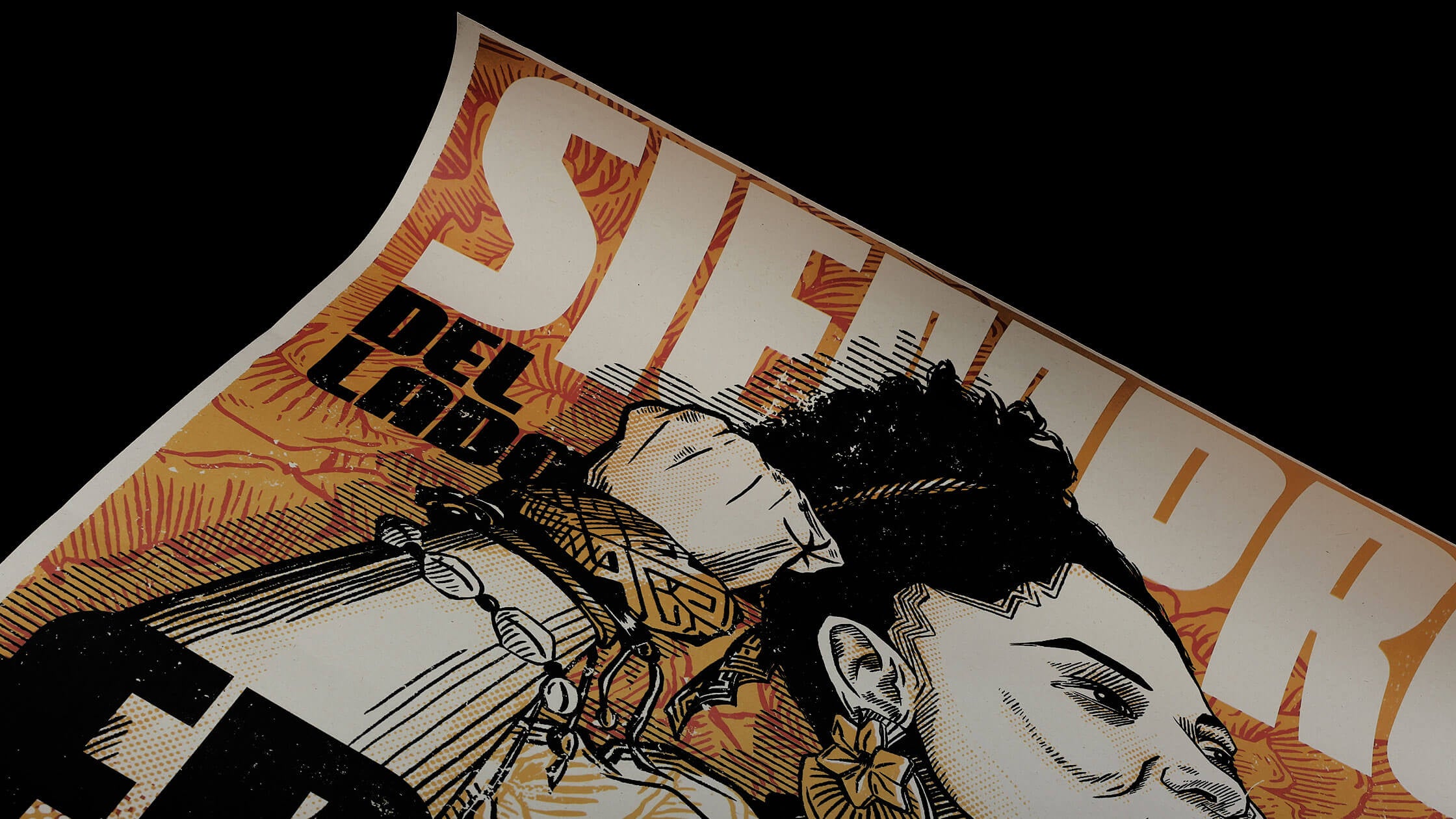
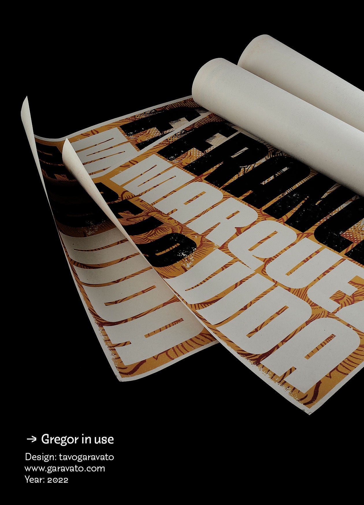
eng // Gregor is a hybrid sans serif typeface family with two variants: Upright and Slanted. The design is inspired by some advertising graphic designs used in the United States during the 60's and 70's. It has a geometric appearance with a condensed structure and a Black weight that allows being used in short sentences and titles with sizes greater than 20 points. The concept behind the design responds to generating distinctive letterforms that enhance the message creating hierarchy and emphasis in the word. Additionally, it has a set of characters that includes the Latin and Cyrillic alphabet, alternates, geometric shapes, miscellaneous and a large number of ligatures that increase possibilities of use.
↓
esp // Gregor es una familia tipográfica híbrida sans serif con dos variantes: Upright y slanted. Su diseño está inspirado en avisos publicitarios utilizados en los Estados Unidos durante las décadas de 1960 y 1970. Presenta una apariencia geométrica con una estructura condensada y un peso Black que permite su uso en frases cortas y títulos con tamaños superiores a 20 puntos. El concepto detrás del diseño busca generar formas de letras distintivas que realcen el mensaje, creando jerarquía y énfasis en la palabra. Además, cuenta con un conjunto de caracteres que incluye los alfabetos latino y cirílico, alternates, formas geométricas, símbolos misceláneos y una gran cantidad de ligaduras que amplían sus posibilidades de uso.


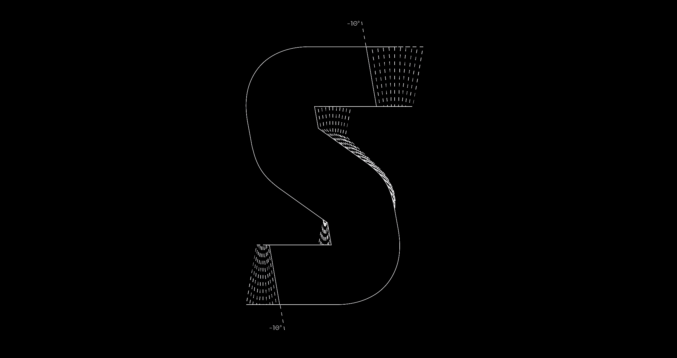
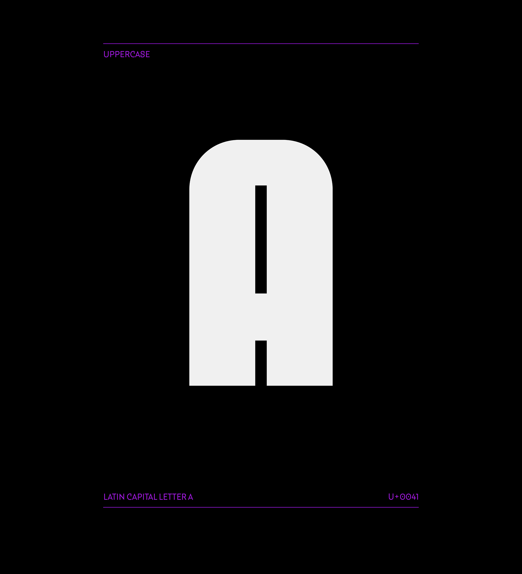
eng // Gregor has a mechanical appearance, with straight shapes and geometric curves that give it an industrial spirit. Its external shapes and internal counterforms feature precisely calculated and systematized cuts in a modular way throughout the entire character set, which became a distinctive visual characteristic of the design process. These features ensure good readability at large sizes, and its weight creates a strong impact in title functions.
↓
esp // Gregor posee una apariencia mecánica, con formas rectas y curvas geométricas que le aportan un espíritu industrial. Sus formas externas y contraformas internas presentan cortes calculados y sistematizados de manera modular en todo el set de caracteres, lo que se convirtió en una característica visual distintiva del proceso de diseño. Estos rasgos garantizan una buena legibilidad en tamaños grandes, y su peso genera un gran impacto en funciones de título.


Tipos Latinos 2022 | 9a Bienal de Tipografía Latinoamericana
Winner
-
Gregor Complete Family
$45.00 USD
-
Gregor
$45.00 USD
-
Gregor Slanted
$45.00 USD