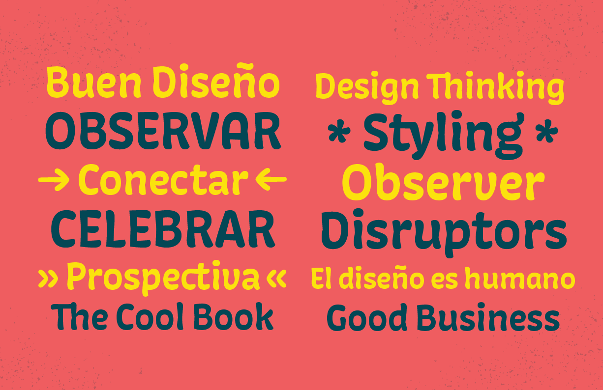
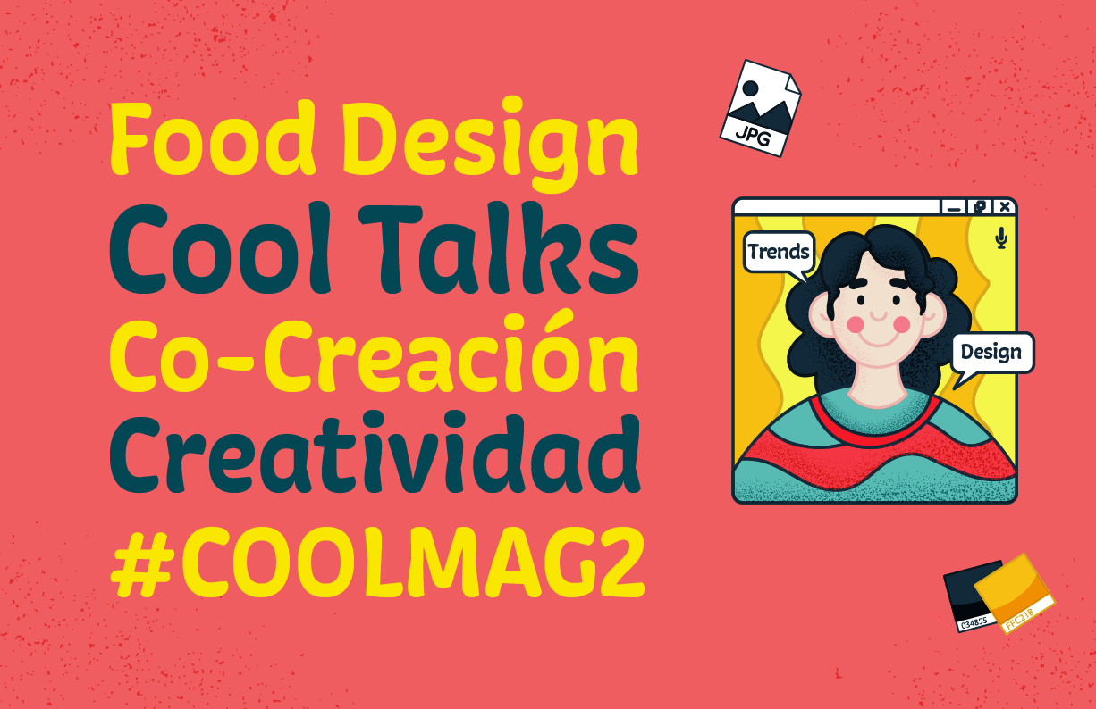
Custom typeface designed for the communication of ImasD design studio. It is a one-style typeface designed in order to reflect the personality of the brand: curious, fun, close, flexible and innovative. The aim was to rescue the conceptual values of these brand expressions, reinterpreting them in its letterforms.
The process behind this project involves different voices in a collaborative work that was developed in several work sessions with the entire creative team of the studio. In the first sessions we try to understand the personality of each member of the team and how to capture a unique personality in letterforms. Step by step we create a basic alphabet that will show not only graphic features but also emotions behind its design.
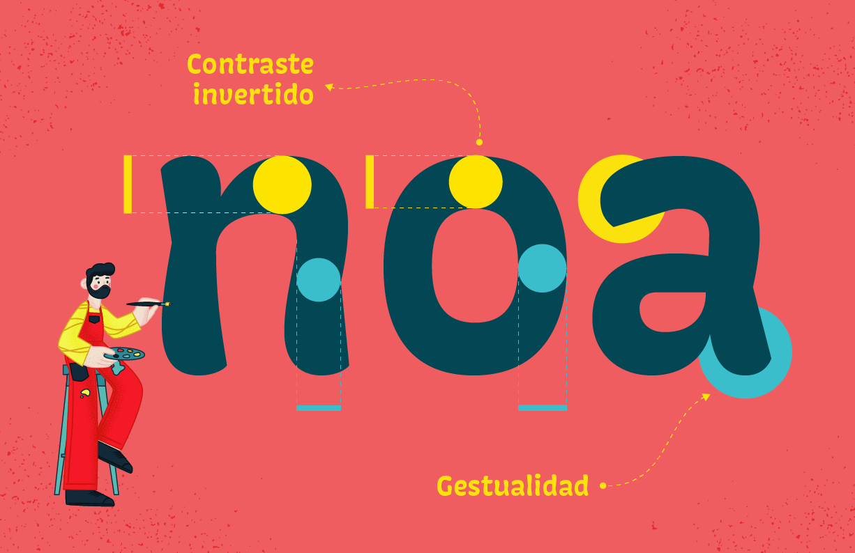
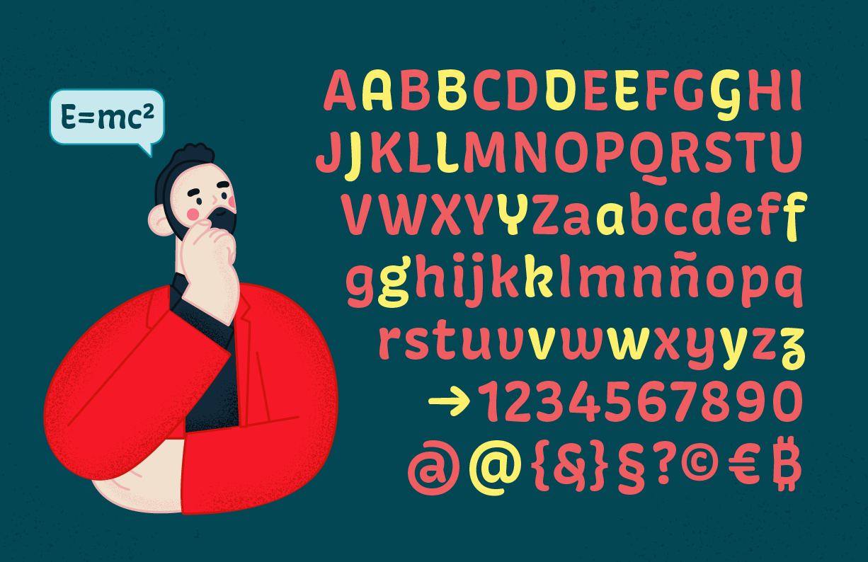
The final result is characterized by having a casual and fun appearance, which is evidenced by its inverted contrast and unexpected shapes in several letters that are part of the system.
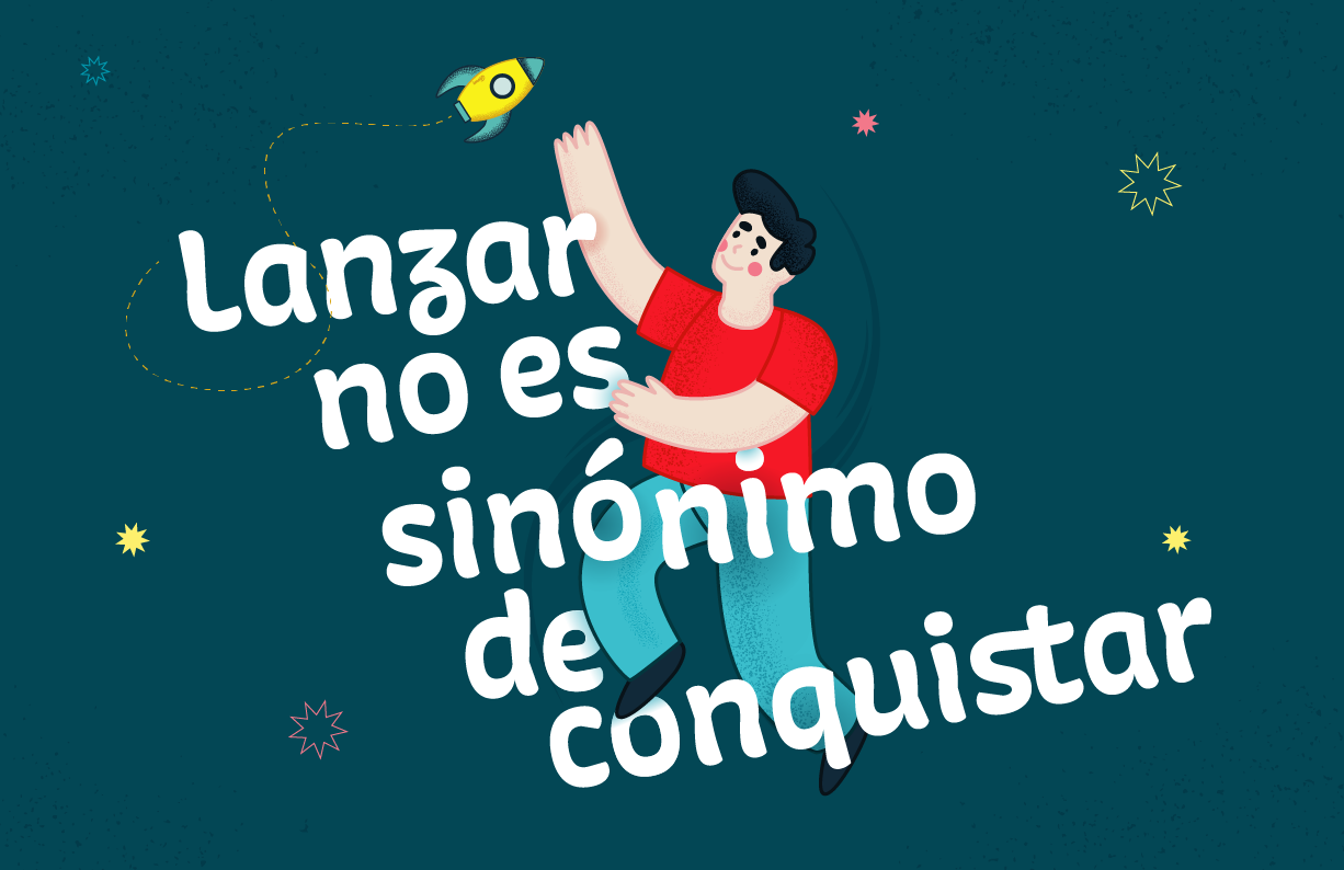
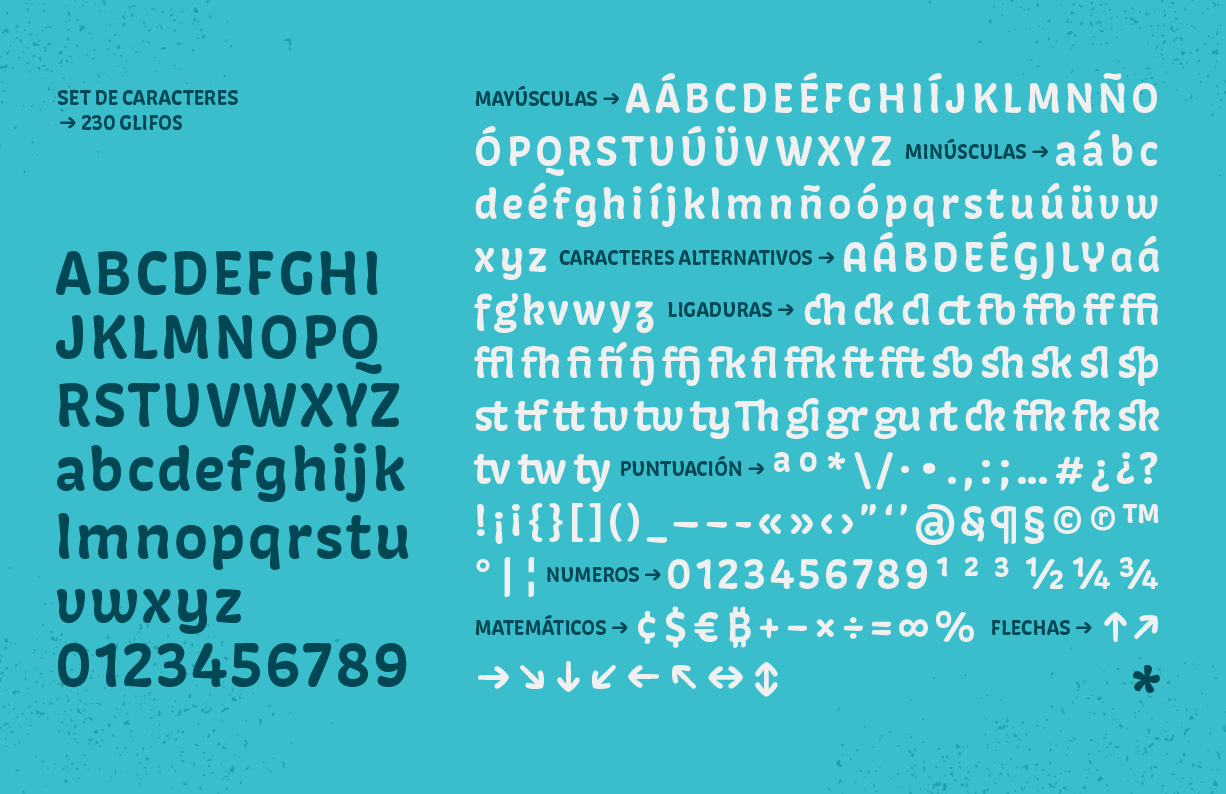
The use of the typeface is intended for titles and short sentences in print and digital media. It has a set of characters that mainly covers Spanish, English and Portuguese, and it has a character set with a great variety of alternative characters and ligatures, which offer different composition possibilities and increase its expressive potential.
